Category Archives: Minneapolis

Minneapolis – Skyscrapers and Skyways

A few more final pics from Minneapolis:

Skyscrapers! I’m personally conflicted on DC’s height limit, as it does some great things for urbanism, but also has some negative impacts.  I also really like tall buildings, but they’re certainly not the be-all and end-all.

The skyline, as seen from the campus of the University of Minnesota:
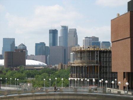
IMG_4499

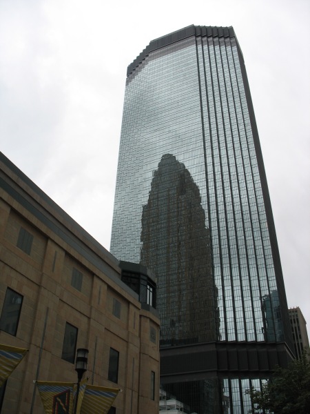
Minneapolis’ IDS Center, reflecting the Wells Fargo Center.
IMG_4450

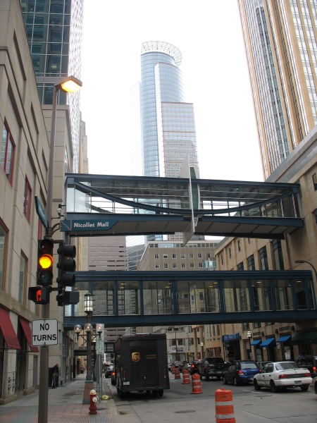
The third of Minneapolis’ big three skyscrapers is 225 South Sixth, seen here with a couple of Minneapolis’ infamous skyways in the foreground:
IMG_4448

Skyways: They are perhaps the single most identifiable thing about downtown Minneapolis.  The city boasts of the largest such network in the US.

St. Thomas University (which has business and law programs downtown) has a nice map of the skyway system, showing what a rats nest it can become as you navigate the 2nd floor of these buildings:

Minneapolitans love their skyways.  Growing up, they were just a fact of life.  It was only until I really got to visit other cities without them that I realized their detrimental impact on streetlife and the urban streetscape of downtown.  Minneapolis, however, almost seems to embrace it:

Seem a little quiet on the street? Minneapolis and Saint Paul are both home to a unique system of glass “tunnels” located one story above ground. We call them skyways–you can just call them convenient. Downtown Minneapolis’ 8-mile system and downtown Saint Paul’s 5-mile system will get you almost anywhere in climate-controlled bliss.

Ditch the coat in the hotel room and go exploring in this lively thoroughfare filled with specialty shops, restaurants, services, and, yes, even an annual golf tournament

“Where are all the people?” you ask. Look up. You may be missing something.

“Climate-controlled bliss” might be overselling it a bit.  The skyways are all located on private property.  This isn’t an issue on weekdays when things are busy, but on weekends, some all-office buildings will close up shop and skyway walkers will suddenly encounter a dead end.  Furthermore, as the Minneapolis booster piece indicates, there’s lots of service oriented retail on the skyway level – sandwich shops, dry cleaners, bank branches, etc – all sorts of things you’ll find in downtown DC, as well.  Except that they’re largely inaccessible outside of the normal working hours.

Worst of all, opportunities to connect between the street and the skyway level are few and far between, and most of them are in building lobbies which are subject to private control.  The result is a confusing network that only the experienced can navigate well.  The comparison to habitrails isn’t all that far off base – being back in the system for the first time in a few years, I felt like a lab rat running through a scientist’s maze looking for a bit of cheese.

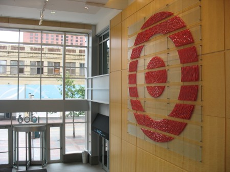
Ascending into the system in the lobby of one of Target’s many downtown buildings shows some of the limits to the system.  During my last trip to Minneapolis, I tried to enter the skyway system at this same point – but since it was a weekend, the door was locked.  No dice.
IMG_4456

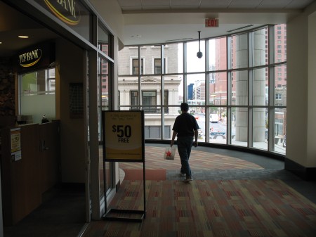
On the second level, you’ll find all sorts of retail options.  Here, as you traverse along the perimeter of a building’s second floor, you can also do all your banking at the same time:
IMG_4457

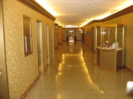
It’s carpeted and climate controlled.  The newer buildings downtown, built after the system took root, actively design for them.  They can be very mall like, where building lobbies help provide vertical circulation between levels.  This still doesn’t solve programmatic issues such as the locked doors on weekends (as that Target building is only a few years old), but it helps.  Older buildings have carved corridors out of second floor space, lack retail options, and can be extremely confusing to navigate:
IMG_4459

Somewhere in here I encoutered a dead end where my only option was to enter the parking garage and take a staircase down to the sidewalk level.  Likewise, there are plenty of areas where your directionality is challenged – to go north, you actually have to head east and then north.  It’s a system that favors the experienced.

Skyways can be a touchy subject for Minneapolitans.  Any time an outsider criticizes the system, they usually get lambasted as ignorant of the peculiarities of urbanism in northern climes.  One local critic is Steve Berg, a longtime writer and critic in the Twin Cities.  Berg compiled opinions of various urbanists on the skyway system, and the results weren’t exactly complimentary:

When two of the world’s top urban designers drop in for a visit and come away with the impression that your city — in this case Minneapolis — is a relic of the 1970s, ill-equipped to thrive and compete in a new century, and that its only hope is to tear down its skyways, well, that gets your attention.

“I feel sorry for Minneapolis,” said Jan Gehl, the celebrated Danish architect whose work around the world has linked the rising importance of good public spaces to a city’s success.

Thirty years ago, Minneapolis was thought to be a leader among winter cities. But taking people off the streets and putting them upstairs, “under glass,” hasn’t worked in Minneapolis or anywhere else, Gehl said, to the point that Minneapolis is no longer “up to the beat of the world-class cities of the 21st century.”

Gehl and Gil Penalosa continue:

The problem, Gehl explained, is that skyways violate the first law of successful city-building: keeping people together in a critical mass. Minneapolis’ skyways — as with similar pedestrian bridge or tunnel systems in Calgary, Toronto and elsewhere — disperse people over different levels at different times. On weekdays, skyways bustle and shops flourish for a few hours a day. But at night and on weekends, people are thrown out onto barren and neglected public sidewalks. A social hierarchy develops: the wealthier classes in private spaces on weekdays; poorer people out in public spaces at all hours. That’s not a winning formula, Gehl said. It’s bad for retail business, bad for culture, bad for civic life.

The impression given, said Penalosa, is of a fearful city crouching inward against a hostile climate and a hostile world. That’s not the kind of optimistic city that most people — especially young people — are looking for, he said. Repeating the phrases of economist Richard Florida, Penalosa said that if a city doesn’t present itself as vital at street level, then talented people won’t choose to live there, especially when they can live in Chicago or Seattle or anywhere they like. And if talent isn’t attracted or drifts away, then the quality of a city suffers.

What’s remarkable to me about Minneapolis isn’t that the skyways are bland, but that the city is as successful as it is in spite of the extensive skyway network.  The elements are all there, but they haven’t quite been tied together in the way that makes urban areas great places.  Indeed, some of Minneapolis’ best public urban spaces are places the skyways bypassed – the Warehouse District, Uptown, and others.  Still, the challenges that these skyways present to Minneapolis now, as it sits on the cusp of providing an even better urban experience, should be fair warning to other cities about the road not to take.

Minneapolis – Transit plans

A few more items from my trip to Minneapolis. The Twin Cities have some big plans for transit improvements.

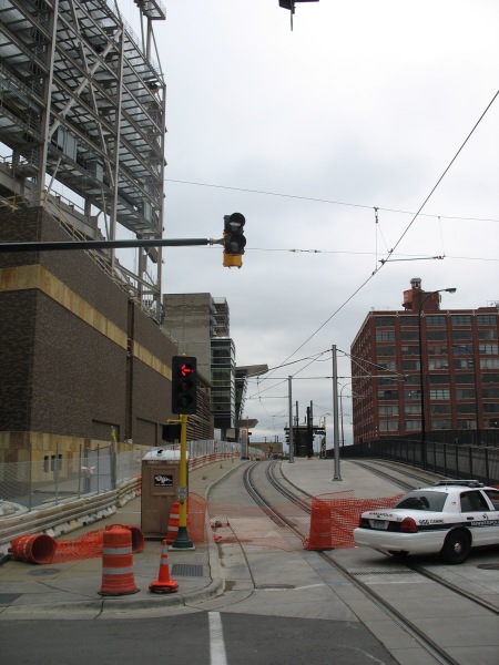
Under construction now is the Northstar Commuter Rail line, as well as the concurrent 2-block extension of the Hiawatha LRT to meet the commuter rail station.   The new station would be a potential hub of multiple light rail lines, as well as the terminus of several commuter rail lines and even intercity high speed rail.  Lofty ambitions, to be sure.
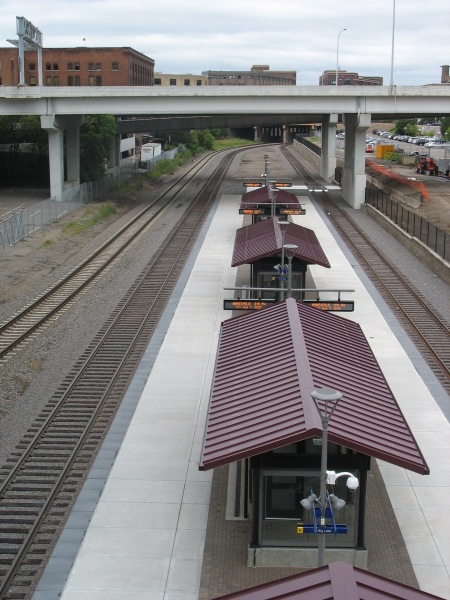
However, at present, it isn’t exactly the second coming of Union Station:

IMG_4476

One platform, two tracks (the third track on the far left is for through freight).  This picture was taken from the 5th Avenue bridge.  The area with the commuter rail platform is in an old rail yard substantially sunken beneath the usual grade for the rest of the area.  All of the cross streets in the area traverse the ditch on viaducts.
IMG_4475

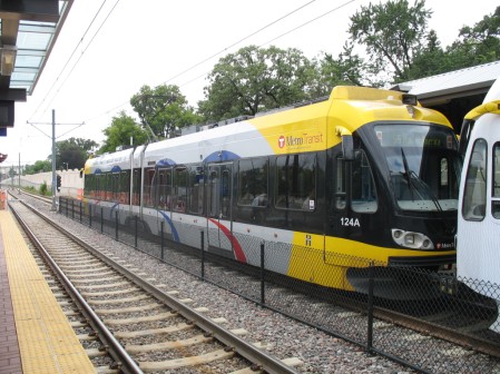
Immediately above the commuter rail platform is the new Ballpark station (that’s Target Field under construction in the background).  The Ballpark will feature vertical circulation for passengers transferring between commuter rail and light rail. The extension of the tracks (as well as the commuter rail) should be operational soon, with the ballpark to open next season.

IMG_4471

Right now, only the Hiawatha Line uses these LRT tracks.  Soon, the Central Corridor will join them, offering LRT service to the University of Minnesota and downtown St. Paul.  The next corridor under consideration will be the Southwest Corridor, extending from downtown Minneapolis to suburban Eden Prairie.

Both the Hiawatha and Central lines serve some prominent employment centers, as well as relatively dense neighborhoods and industrial space in need of redevelopment.  The Hiawatha line connects downtown Minneapolis with the airport and the Mall of America.  The Central corridor will extend between the two downtowns, serving the University of Minnesota.

The Southwest line, however, could potentially miss some of the densest, most vibrant areas of Minneapolis in favor of a cheaper alternative routing.  Yonah Freemark analyzes the situation:

After years of study, Minneapolis is almost ready to submit its locally preferred alternative (LPA) corridor to the Federal Transit Administration, which will distribute up to 60% of total funds to the project through the New Starts major capital grant program. In order to receive money from Washington, Metro will have to show that the proposed route meets national cost-effectiveness guidelines, which are stringent enough to sieve out a large percentage of proposed new transit lines.

This requirement puts elected officials in a quandary: should they work to build the most effective transit network possible, or should they limit their ambitions for fear that the federal government will rule out any funding at all?

Effectively, this is where Minneapolis finds itself, and the region is coming dangerously close to eliminating its best route option because of cost-effectiveness concerns. Of the three routes being considered for the Southwest Transitway’s alignment, one (#1A) has been dismissed by suburban officials because it won’t serve the city of Eden Prairie as effectively as the others, even though it would be cheaper to build. Another (#3C) is too expensive because it would require a tunnel under a section of Nicollet Avenue, but it would serve the city of Minneapolis best because it would provide several stations in the dense and active Uptown district. 3C would operate on the Midtown Greenway parallel to Lake Street in that section of the city. The last (#3A) is the only route, according to local planners, that could meet federal cost guidelines — but its effect on the commutes of people who live in Minneapolis would be marginal. 3A would skim the side of the Kenilworth trail and lounge the edge of two lakes, running through neighborhoods of single-family housing.

Yonah created a series of maps showing how the FTA’s cost-effectiveness numbers will likely lead to an inferior project overall.  One picture really shows how absurd the decision might be in deciding the two alignments to enter downtown Minneapolis:

Minneapolis has some promising long term transit plans, but I can’t think of a better example to showcase how misguided the FTA’s cost-effectiveness guidelines are if they favor the green line instead of the blue line on that map.

More warehousing

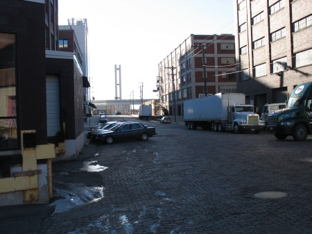
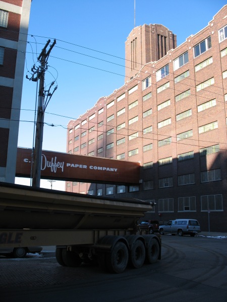
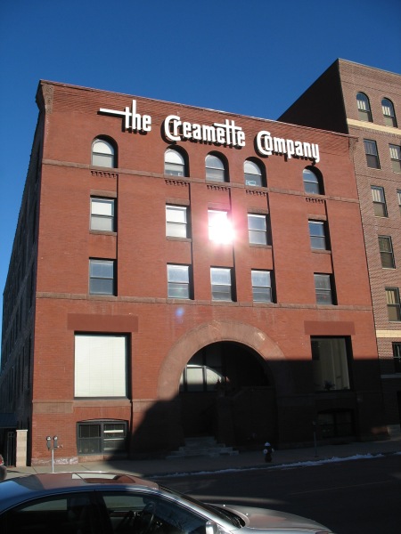
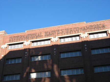
Building off the previous posts on warehouses and their districts, I have some more pictures from my most recent (and a few older ones as well) trip to Minneapolis, focusing on the Warehouse District.

IMG_4477

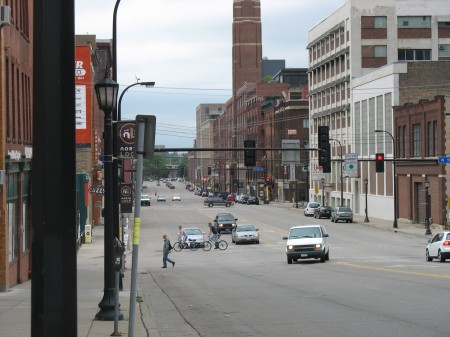
Two main streets define the Warehouse District – Washington Avenue and 1st Avenue.  These streets run perpendicular to each other.  Washington runs (kinda) East-West (Minneapolis’ street grid downtown is skewed off axis, orienting towards the Mississippi River) and 1st runs North-South.

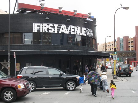
First Avenue is closer to the core of downtown, and the warehouses there are more ornate and quicker to redevelop.  At the southern end of 1st Ave is Minneapolis’ arena, the Target Center, as well as the legendary music venue, First Avenue:

IMG_4463

You can almost hear Prince doing a soundcheck inside.

Washington Avenue is revitalizing as the new North Loop neighborhood, but it’s still a raw place:

IMG_1184

There’s been plenty of new investment in the area, both in renovations and new construction:

IMG_1205

IMG_1203

New developments are adding retail to the area, complementing some older establishments:

IMG_1181

IMG_1186

And all this time, industry rolls on in the area:

IMG_1200

IMG_1202

And there are plenty of vestiges from past industries – Creamette, International Harvester,

IMG_1170

IMG_1196

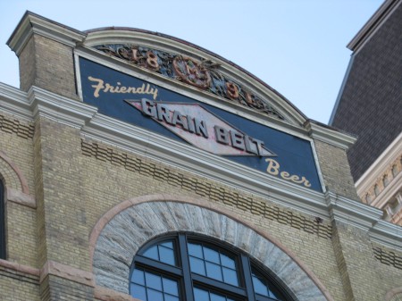
And a little outside of the Warehouse District proper – the old Grain Belt Brewery:

IMG_1235

Minneapolis – Nicollet Mall

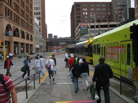
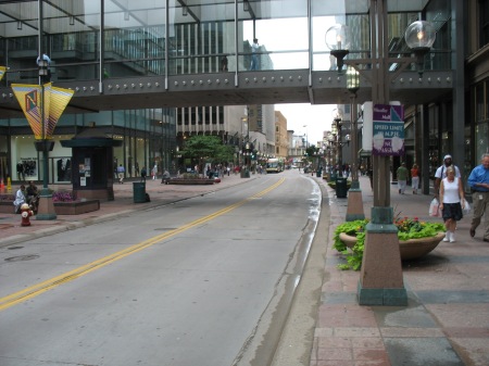
Some more photos from my trip to Minneapolis.  My light rail ride into downtown ended at the Nicollet Mall station.  Once arriving in downtown, the Light Rail line runs through the city on 5th St.  Because of the dedicated right of way (even though there is substantial cross traffic), 5th street is more or less a de-facto transit mall.  However, Minneapolis has a more prominent transit/pedestrian mall – the Nicollet Mall.

Nicollet Mall encompasses the bulk of Nicollet Avenue as it runs through downtown.  The Mall was created in 1968, like many of its counterparts, as a response to downtowns losing retail market share to suburban shopping malls.  At that time, Minneapolis bulldozed their most prominent retail street and re-built it as a pedestrian and transit mall.  It was one of the first, and remains one of the most ‘successful’ malls – along with the 16th Street Mall in Denver, State Street in Madison, and a handful of others.  There have been far more failures than successes here, I’m afraid.

Nevertheless, the Mall worked here.  At least, it didn’t completely fail.  Downtown continued to lose retail in the grand scheme, and Minneapolis’ skyway network proved to be a Faustian bargain – keeping many offices downtown by offering the same kind of climate control you’d find in suburban office buildings with nice connections to their parking garages, but at the expense of any sort of street level retail or streetscapes.  For better or for worse, the skyways are part of Minneapolis’ heritage.

Perhaps that kind of heritage stacks the deck for something like the Nicollet Mall to succeed.  It’s the one street in downtown where the sidewalks are generous, as is street-level retail frontage.  Arriving from the Hiawatha Line, you enter the Mall on the northern end, at the intersection of 5th and Nicollet:

IMG_4440

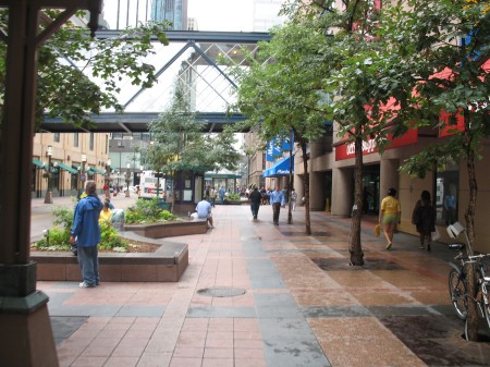
As the light rail trains continue down 5th street, most pedestrians hang a left onto Nicollet.  Once there, they’re greeted with the one downtown street with nice trees and wide sidewalks:

IMG_4449

The fact that no other streets downtown have good street trees is a bit puzzling, since Minneapolis as a whole has some of the best urban forests and tree canopies of any American city.  But not downtown.

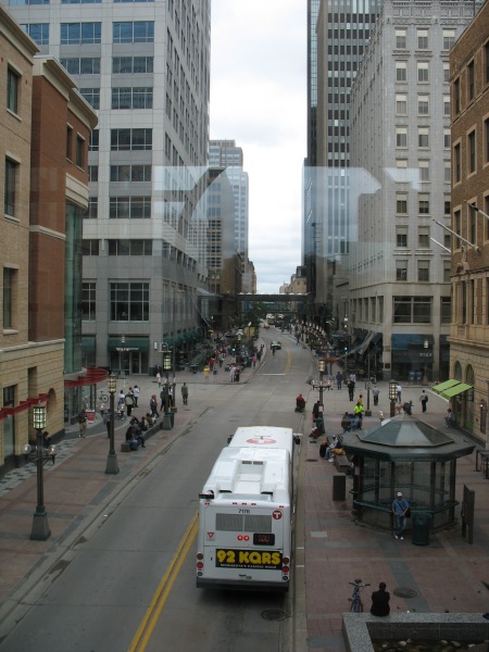
The transitway itself does not shoot straight down the center of the right of way.  Instead, it weaves back and forth, like a wave.

IMG_4447

IMG_4452

IMG_4458

The weaving is an homage to Minneapolis’ aquatic history and connections.  The City of Lakes takes water seriously – as it provides some of the greatest amenities today, yet was also the sole economic reason for the city existing at all.  Functionally, however, the weaving of the traffic lanes allows for a minimum sidewalk width along both sides of the street, while also providing adequate space on the wider portions for street art, bus shelters, fountains, benches, etc.

Nicollet Mall also hosts a weekend farmer’s market, numerous civic parades and festivities, and all sorts of other hullaballoo.  These events usually happen on evenings and weekends, however – where buses are re-routed to adjacent side streets.

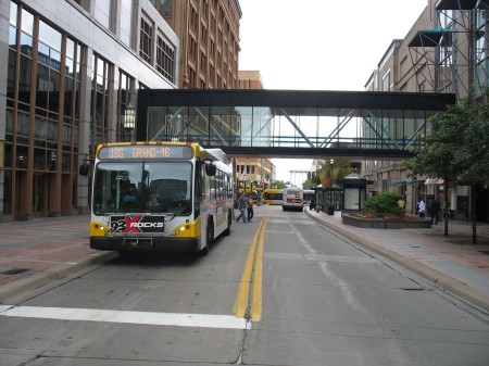
A great deal of Minneapolis’ north-south bus routes through downtown utilize the Mall. From the photos, you’ll notice that those buses are the only vehicles using it.  Taxicabs are allowed after the evening rush, and bicycles are similarly restricted from riding on the Mall, much to the dismay of sign vandals:

IMG_4453

The lack of regular facilities for cyclists brings to mind the debates over the configuration of the K Street transitway, and the role bike lanes should have in it.  It raises the question if it’s possible or desirable to have all streets downtown serve all modes, or if prioritizing one mode on a few streets over others is sufficient.

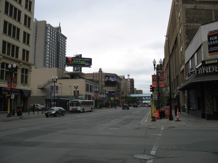
Minneapolis’ problem is that all of the other streets in downtown have cars as the top priority.  Though bike lanes have been added in recent years, the overall pattern is unmistakable:

IMG_4460

Hennepin Avenue, above, has the potential to be a great urban street – but storefronts are spotty, sidewalks narrow in relation to the traffic lanes, and the urban fabric is a bit disconnected in spots by surface parking lots.  There are many great old theaters in the area that would be a tremendous asset to the city, but the streetscape isn’t quite there yet.

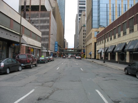
Other streets, particularly many cross-streets running east-west, are even worse:

IMG_4461

Almost all of them are one-way pairs.  I don’t have any information on Minneapolis’ downtown traffic, but I don’t ever recall the area’s small and compact grid being unable to handle traffic – removing one of those lanes and widening sidewalks a bit, adding trees, bike lanes, and the like would be a tremendous improvement.  Street frontage along those sidewalks would instantly become more inviting.

In some respects, however, the issues of streetlife and vibrabcy are a chicken and the egg problem.  Sure, there are design issues – but you need a base of customers and residents to support those retail spaces.  Nicollet Mall does an excellent job of concetrating that retail energy in one place that can achieve critical mass, but even that shows the weaknesses of Minneapolis’ current downtown demographics:

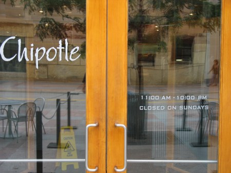
IMG_4454

Closed on Sundays?  A big chain like Chipotle is the kind of place you’d expect to lead the charge to be open on Sundays.  I’ve seen longer lines during the weekends at the Gallery Place Chipotle than I see during the normal lunch rush.

This particular Chipotle is located in the base on the Target world headquarters building, fronting on Nicollet Mall.  The retail spaces along the Mall are all occupied, and Target’s two-block complex includes this Chipotle, the Dakota jazz club, the News Room bar, a 2-story urban Target, and other retail as well.

That urban Target Store (at the base of Target’s world headquarters) did not come easily.  This may seem like a common tale to anyone who’s followed the DC USA development:

There have been plenty of criticisms during this election year. The three top challengers in the Minneapolis mayoral primary railed against Sayles Belton’s support of the project, portraying it as a gift to Target and developer Ryan Construction at the expense of small business and affordable housing. Remaining challenger R.T. Rybak continues to hold it up as the quintessential example of so-called corporate welfare.

At the same time, there are different versions of how much the city paid. The Minneapolis Community Development Agency, the office that shepherded the deal, puts the public cost close to $60 million. MCDA project coordinator Phil Handy says $35.5 million of that goes for what’s called site assembly – buying the land, paying legal and regulatory costs, and cleaning up any lingering pollution – things that would need to be done no matter who developed it. Handy says much of the rest, nearly $18 million, paid for construction of the underground parking ramp that the city now owns and operates. Handy says this money shouldn’t be viewed as a subsidy.

It’s worth noting that R.T. Rybak is now the Mayor of Minneapolis, though this was hardly the sole reason for his election.

One other requirement the city put out for Target’s development of the area, however, was that each of their buildings would have retail spaces fronting the street on all sides.  However, except for the Nicollet Mall facade, those storefronts remain empty and have never been filled.  Target, as a landlord, isn’t actively seeking tenants.

Minneapolis has made great strides as a city since I grew up there, but it’s still got a ways to go before becoming a full time big-city downtown.

Minneapolis – LRT Stations

Following up on the post from the Mini-apple on LRT vehicles, I’d like to show some of the more interesting details from the LRT stations that dot the line.  It’s an interesting contrast to DC and Metro.

Metro was designed as a coherent system – from the way the routes interact with one another to the way the signage meshes with the station architecture.  Initial concepts were for all stations to be exactly the same, and though this was soon abandoned in the face of realistic problems, all of the stations in the system nevertheless share several key design principles and materials.  The common elements are so strong that minor deviations from those principles stick out like sore thumbs.

In Minneapolis, such a rigid, systemic design approach wasn’t used.  Each station has not only a rather unique design, they all have their own personality that explicitly aims to reflect the neighborhood they serve rather than the uniformity of the system.  Such is the difference between Federal orthodoxy and Minnesota Nice, I guess. There are a few ‘boilerplate’ stations where the structures are the same, but each station still has distinct color schemes and other small details.

Moreover, each station has a plethora of intricacies for riders to discover.

IMG_4435

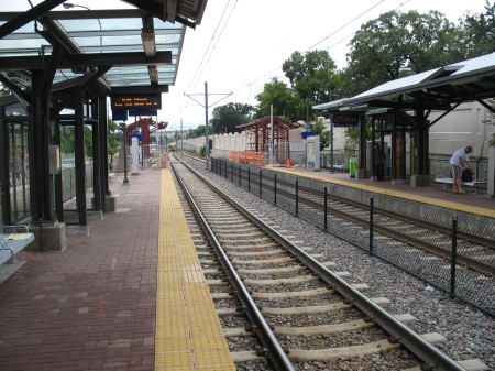
All stations have several common elements – some sort of partial canopy cover, benches, wind screens, ticket machines, etc.  The details of those elements is where the variations can be found.

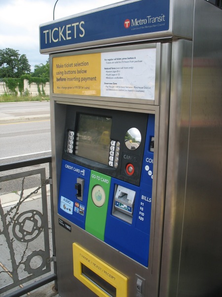
The ticket machines are relatively easy to use – nice and straightforward, accepting of cash and credit.  Your fare is good for 2.5 hours.  It’s a proof of payment system, so you have to grab a ticket before hopping on.

IMG_4434

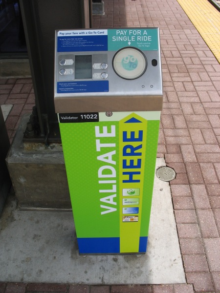
The green circle in the center is an RFID card reader for using a Go To card (Metro Transit’s version of SmarTrip) to purchase a card.  They also have separate machines that cater only to Go To card holders.  Tapping the circle without selecting anything will automatically validate you a base ticket, but there are other options available if you go through the menu (such as buying multiple tickets at once for friends, purchasing longer, round trip fares for sporting events lasting beyond the 2.5 hour time window, etc):

IMG_4433

Once you’ve got your ticket, then you gotta wait for the train.  Currently, headways aren’t bad (but not great, either) – 7.5 minutes during rush hour and 10 minutes at most other times.  Since you’ve likely got some time to kill, you can check out some of the station’s details.

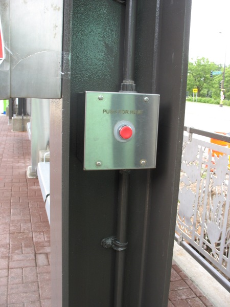
Cold?  Turn up the heat:

IMG_4431

Pushing the red button activates a space heater overhead.  Note the detail on the railing behind the post – there are several different patterns for the various stations.  There’s also work screened onto the glass of the windscreens:

IMG_4430

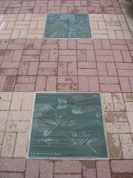
If you can’t tell (and I won’t expect anyone to at this resolution), that’s a long poem shaped in the silhouette of a tree imposed on the glass – that looks out over Hiawatha Avenue at some other nice trees in Minnehaha Park.  Minnehaha Park is the home to Minnehaha Falls, where the Minnehaha Creek cascades down toward the Mississippi River.  There’s some good fishing in the area, and the connection to wildlife at this station is emphasized with reliefs in the pavers:

IMG_4429

You gotta love the Largemouth Bass.

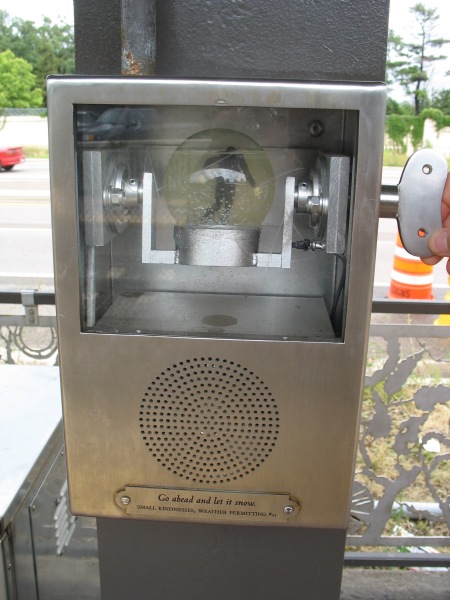
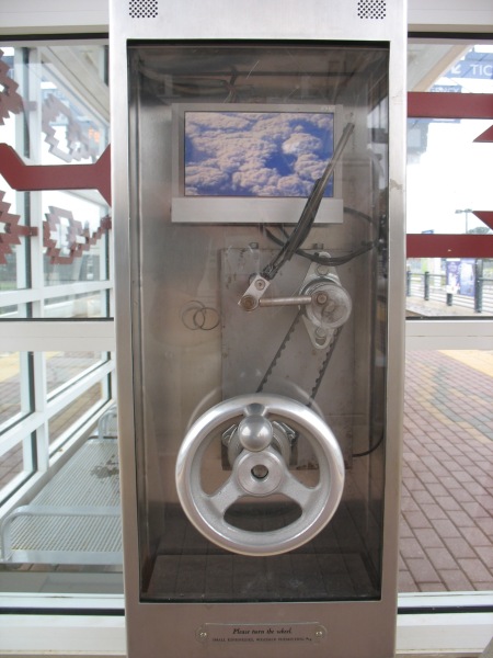
If those passive details aren’t enough to hold your attention, there are other entertainment options.  At stations along the line, there are multiple boxes labeled as “Small Kindnesses, Weather Permitting.” These are a public art installation by artist Janet Zweig:

This public project is an interactive artwork for 11 stations of the Light Rail. There are three or four small kiosks at each of the stations, 35 kiosks in all. There are 11 different kiosk designs: 7 audio designs and 4 video designs, made in editions of 3 or 4 each. Designs include a windshield wiper, a doorbell, a telephone, a curtained theater, a revolving snow-globe, a pinball game, and a “thanks a million” machine. Each unit has a mechanical initiator (like a hand crank, a push button, a lever) and a digital output — either audio only or video with audio. Each unit is weather-proofed, protected behind tamper-proof glass and enclosed in a steel box attached to a station column. The LCD monitors are heated for the cold Minnesota winters.

In the winter of 2003-4, we held a competition for Minnesota filmmakers, videographers, singers, storytellers, comics, etc, to provide content for the kiosks, all on the theme of weather or courtesy (“Minnesota Nice”), the two cliches about Minnesota. The collection of 114 audios and 78 videos were made by over 100 Minnesotans, the result of an open competition and ongoing solicitation of talent through suggestions from arts professionals in Minnesota. The clips last from 30 seconds to 3 minutes. They range from the comedic to the serious, from professional to amateur. On an ongoing basis, this content is delivered to the 39 units, activated when someone on the platform discovers the unit and activates the mechanical initiator. All content goes to every kiosk, providing visitors with always varying artwork while waiting for the trains.

IMG_4432

Go ahead and let it snow.

IMG_4485

The popularity of the line is self-evident both from the patrons and from the construction.  When initially built, several expensive stations (those underground or on aerial structures) were built to accommodate three-car trains, the theoretical max for the system.  All the remaining stations are currently having their platforms extended to meet the demand for three-car trains (a single articulated car is about 95 feet long, thus a three-car consist would be close to 300′ long total, just shy of a 4-car Metro train).

IMG_4428

Every station has a couple of platform information displays, as well.  However, the best these do is display rolling information (such as station closures – there were a couple on this day for platform extension work) and the time of day – as well as the vitally important information telling you that you’re riding the Hiawatha line.  No next train arrival time – perhaps one of the single greatest things about DC’s Metro stations.

You wouldn’t think this feature would be so difficult to implement…

IMG_4436

DC's few old warehouses

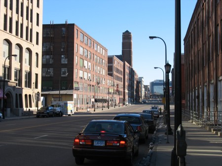
My trip back to Minneapolis offered a great chance to see and experience some great old urban warehouses.  Warehouse districts are common in many old industrial cities.  In Minneapolis, the old industrial aesthetic abounds – these massive brick structures hulk over the street, but offer a fantastic level of detail and craftsmanship.

IMG_4466

These warehouses sit along 1st Avenue in Minneapolis, probably the most prominent nightlife district within downtown.  That wasn’t always the case, as these warehouses were used as artists lofts and other more marginal uses (looking for cheaper rents) just 10 and 20 years ago.  They’re extremely versatile buildings.  Compared to their contemporary structures in the suburbs, I think it’s safe to say that we don’t build ’em like we used to.

As I was admiring these structures in Minneapolis, it was fitting that Noah Kazis had a series of posts about one of the few areas in DC that has a similar aesthetic.  DC never had the industrial legacy that Minneapolis did, thus it doesn’t have the same kinds of legacy buildings and warehouses.  There are a few exceptions in Georgetown, the Navy Yard, and along the rail lines behind Union Station – which was the focus of Kazis’ posts.  They are divided into three parts, focusing on the Government Printing Office, the Gales School, and a concluding post.

Kazis lays out the basic premise for these posts:

Between North Capitol and Massachusetts Avenue, G Street NW is a block of urbanist paradox. Two sites, the Government Printing Office and the Gales School, pose difficult to answer questions about the proper place for older, grittier urban uses in districts of modern office buildings. In a series of posts today, I’ll explore a block of D.C. that gentrification somehow passed over.

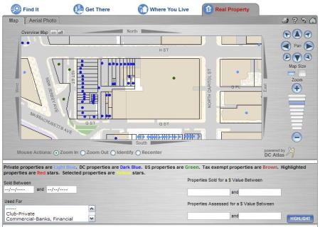
I’m not sure framing this as an example of spotty gentrification is the best approach.  For one, the entirety of this block, full of surface parking lots and the GPO, is all controlled by government interests.  A search on DC’s Citizen Atlas shows this:

GPO Plat Map

Those dark blue dots are all DC properties, and the green properties between 1st and New Jersey are owned by the Feds.  Given government ownership, you wouldn’t expect these blocks to develop.

Furthermore, I don’t think the lack of development along this block is all that unusual.  Certainly, the location is close to Union Station, but there was (and is) plenty of undeveloped land nearby under private ownership.  Proximity to Union Station hasn’t helped those properties any more or less – and development happening currently is in too narrow of a timeframe to really draw any conclusions.

Likewise, Kazis implies that the block has been encircled by gentrifying properties.  I don’t think that’s the case, either.  To the north, development is sparse, and what does exist is relatively new.  To the west, the Douglas Development Building is more the exception than the rule.  To me, the defining characteristic of that area is the massive barrier created by 395.  The Douglas Development building is more of an island within the sea rather than a contigous growth of redeveloped properties.  Other developments along H St NW are growing from the Chinatown area towards the GPO block, not the other way around.  If you want to look at gentrification as a blob increasing in size, I would argue there are two blobs approaching this area (one from Chinatown, one from NoMA), rather than one that’s enveloped it whole.

Kazis continues on the GPO:

The building is visually interesting and quite historic, but it is also visually hostile to street life. I work a block east of the GPO and my coworker just described that block as “just dead and ugly.” Would this section of NoMa feel more with the GPO replaced by another sterile new office building? Jane Jacobs would weep. The GPO building is also lower-density than much of its surroundings. If density would be increased by exiling jobs to the suburbs (where the GPO would inevitably relocate) would that be a net positive or negative? How comfortable should sustainable transport advocates be with telling 500 transit-riders their jobs are moving out of the city? Is this the mixed-use that we want and or the underutilization of space that characterizes struggling blocks?

I’m not sure what he’s getting at with the density argument – the GPO buildings are each 8 stories tall – plenty dense for urban uses.  As a whole, the site isn’t all that dense, but the surface parking could be easily redeveloped without hurting the GPO’s current configuration.

Kazis concludes:

I don’t predict that either the GPO or the Gales School will survive another twenty years. The GAO will conclude that efficiency calls for selling the GPO to private developers and relocating out of the city. The Central Union Mission will get an offer that a social service agency can’t refuse. And that block of G Street NW will feel more inviting, draw more people onto public transit, send more tax dollars to the D.C. government, and be one more part of a revitalized NoMa. It will be regrettable, even though it will probably be for the best. But we should change zoning, lift height restrictions, and do all the other things that would help us make this area vibrant and put more jobs near transit without needing to bulldoze the past for a downtown that equates health with sterility.

I’m not sure what Kazis’ concern is for the GPO building.  Even if the GPO leaves the area, the building will undoubtedly remain and will not be bulldozed, as the great warehouse districts in Minneapolis and other places show.  These old industrial warehouses are tremendously adaptable spaces.

Urban health need not equal sterility, but urban health also isn’t immune from the larger evolution of industrial practices.  Not only do we not build warehouses and vertical industrial spaces like this anymore, it’s unrealistic to expect those industries to use these ‘outdated’ spaces when it’s not efficient for them to do so.

Nevertheless, I don’t think these changes will lead to the demise of the GPO building.  These kinds of spaces are cherished in other cities, and given DC’s relative lack of that type of building and style of architecture, they should be cherised spaces and development opportunities here, too.

Minneapolis – LRT Vehicles

My semi-regular voyages back home to Minnesota afford me a great chance to ride Minneapolis’ sole light rail line, the Hiawatha Line.  It stands in such contrast to DC’s Metro – Metro is a system, this (currently) is just one line; Metro’s stations are all similar, while each Hiawatha station has individual designs; Metro is relatively old, Hiawatha is almost brand new.

Either way, it’s worth a ride. It even offers a few lessons for DC’s transit systems.

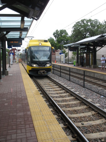
First, a look at the LRVs on the line:

IMG_4425

Many vehicles are fully ‘wrapped’ in rolling ads (such as the 2nd car in the pic above, just off the screen to the right).  Metro’s been doing some of this, but the vehicles are almost never fully encompassed by the wrap, and the fact that they’re in tunnels a great deal of the time means you don’t see giant ads rolling down the street.

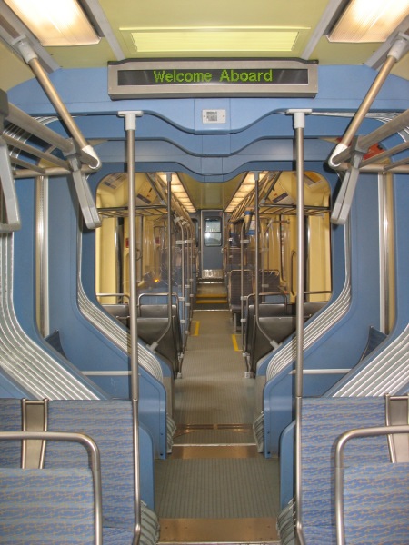
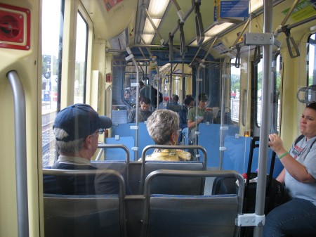
Inside, the cars are relatively spacious, connecting between the articulated portions:

IMG_4479

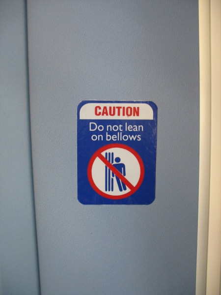
Just make sure you don’t lean on the bellows

IMG_4483

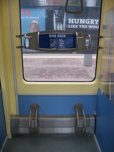
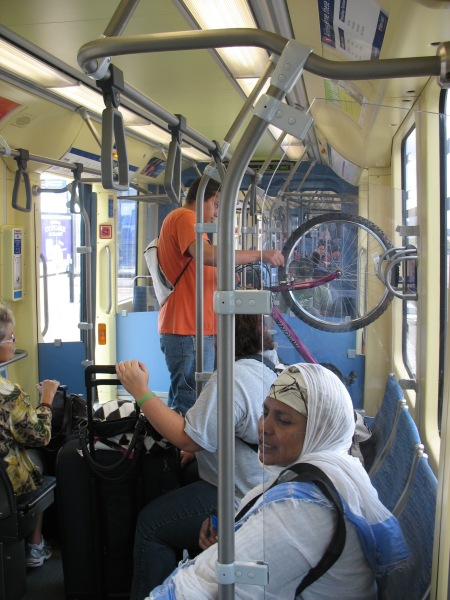
The cars come complete with bike racks, which were well utilized during my weekday rides.

IMG_4478

(also note that the tint on the window in this picture is the interior of a rail car with an ad wrap on it – you can still see out fairly well)

IMG_4439

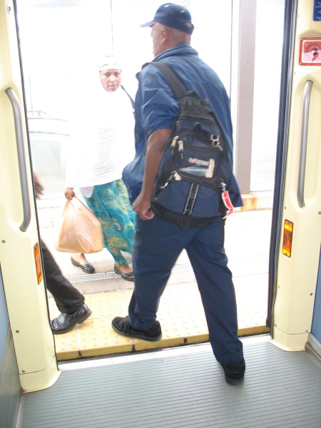
All of the cars have low floors and level boarding with the platforms:

IMG_4438

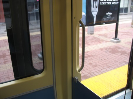
The doors on the cars also push outward towards the platform and then slide to the left or the right, allowing for windows in the vehicle to come right up to the edge of the doors.  Many armchair transit operators wish Metro had more and/or wider doors, but with their current configuration, that would also mean fewer windows on the train – making it harder to see stops, signage, etc.  Might this work in a subway setting? Then again, given the rate at which Metro doors break, adding more complexity to the mechanisms probably isn’t the best idea…

IMG_4481

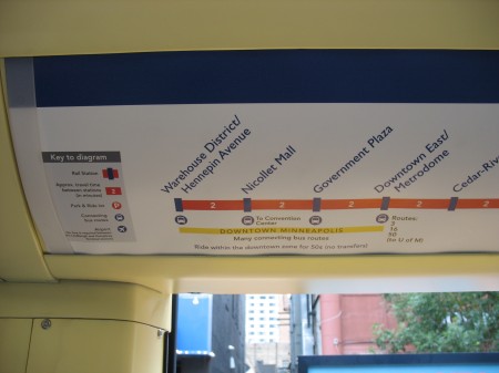
Line signage also offers information on connecting bus routes available at each station, travel time between stations, etc:

IMG_4480

This kind of information can be easily displayed in a static medium (as seen here) on a one-line system, but covering all this information on a much larger system such as Metro is effectively impossible with static signage.  However, the 7000 series railcars will feature LCD displays in each car.  WMATA’s documents indicate those displays would show the “Metro channel,” presumably something similar to the new replacement platform displays they’d like to see.  However, such variable displays would also be able to show information like this, varying depending upon which line the car is serving at that particular time.  DCist at least hinted at the possibility of these LCD displays showing “interactive maps.”

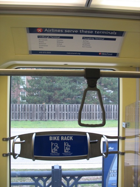
Speaking of signage, the Hiawatha line aims to correct one sore spot of patrons flying out of MSP International – telling you which airlines serve which terminal:

IMG_4487

For those unfamiliar with MSP, each of the airport’s two terminals have LRT stations.  Since the line opened, the smaller Humphrey terminal has seen an increased role in airport operations.  LRVs travel between the two stations 24 hours a day to provide the official circulator between the two, should you need to transfer from one gate to the other (no matter how rare this is).

IMG_4437

Like Metro’s original interior color scheme, I’m not sure this one will stand the test of time – but it’s a functional layout and seems to be well recieved in a region that doesn’t have a strong transit-riding culture (yet).