Category Archives: LRT

Minneapolis – Transit plans

A few more items from my trip to Minneapolis. The Twin Cities have some big plans for transit improvements.

Under construction now is the Northstar Commuter Rail line, as well as the concurrent 2-block extension of the Hiawatha LRT to meet the commuter rail station.   The new station would be a potential hub of multiple light rail lines, as well as the terminus of several commuter rail lines and even intercity high speed rail.  Lofty ambitions, to be sure.

However, at present, it isn’t exactly the second coming of Union Station:
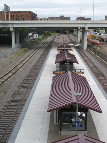
IMG_4476

One platform, two tracks (the third track on the far left is for through freight).  This picture was taken from the 5th Avenue bridge.  The area with the commuter rail platform is in an old rail yard substantially sunken beneath the usual grade for the rest of the area.  All of the cross streets in the area traverse the ditch on viaducts.

IMG_4475

Immediately above the commuter rail platform is the new Ballpark station (that’s Target Field under construction in the background).  The Ballpark will feature vertical circulation for passengers transferring between commuter rail and light rail. The extension of the tracks (as well as the commuter rail) should be operational soon, with the ballpark to open next season.
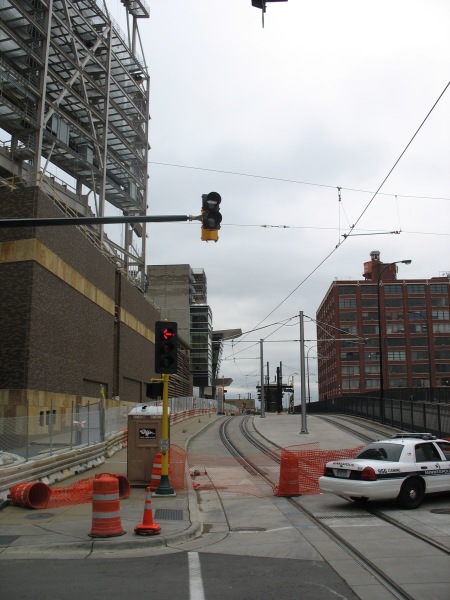
IMG_4471

Right now, only the Hiawatha Line uses these LRT tracks.  Soon, the Central Corridor will join them, offering LRT service to the University of Minnesota and downtown St. Paul.  The next corridor under consideration will be the Southwest Corridor, extending from downtown Minneapolis to suburban Eden Prairie.

Both the Hiawatha and Central lines serve some prominent employment centers, as well as relatively dense neighborhoods and industrial space in need of redevelopment.  The Hiawatha line connects downtown Minneapolis with the airport and the Mall of America.  The Central corridor will extend between the two downtowns, serving the University of Minnesota.

The Southwest line, however, could potentially miss some of the densest, most vibrant areas of Minneapolis in favor of a cheaper alternative routing.  Yonah Freemark analyzes the situation:

After years of study, Minneapolis is almost ready to submit its locally preferred alternative (LPA) corridor to the Federal Transit Administration, which will distribute up to 60% of total funds to the project through the New Starts major capital grant program. In order to receive money from Washington, Metro will have to show that the proposed route meets national cost-effectiveness guidelines, which are stringent enough to sieve out a large percentage of proposed new transit lines.

This requirement puts elected officials in a quandary: should they work to build the most effective transit network possible, or should they limit their ambitions for fear that the federal government will rule out any funding at all?

Effectively, this is where Minneapolis finds itself, and the region is coming dangerously close to eliminating its best route option because of cost-effectiveness concerns. Of the three routes being considered for the Southwest Transitway’s alignment, one (#1A) has been dismissed by suburban officials because it won’t serve the city of Eden Prairie as effectively as the others, even though it would be cheaper to build. Another (#3C) is too expensive because it would require a tunnel under a section of Nicollet Avenue, but it would serve the city of Minneapolis best because it would provide several stations in the dense and active Uptown district. 3C would operate on the Midtown Greenway parallel to Lake Street in that section of the city. The last (#3A) is the only route, according to local planners, that could meet federal cost guidelines — but its effect on the commutes of people who live in Minneapolis would be marginal. 3A would skim the side of the Kenilworth trail and lounge the edge of two lakes, running through neighborhoods of single-family housing.

Yonah created a series of maps showing how the FTA’s cost-effectiveness numbers will likely lead to an inferior project overall.  One picture really shows how absurd the decision might be in deciding the two alignments to enter downtown Minneapolis:

Minneapolis has some promising long term transit plans, but I can’t think of a better example to showcase how misguided the FTA’s cost-effectiveness guidelines are if they favor the green line instead of the blue line on that map.

Minneapolis – LRT Stations

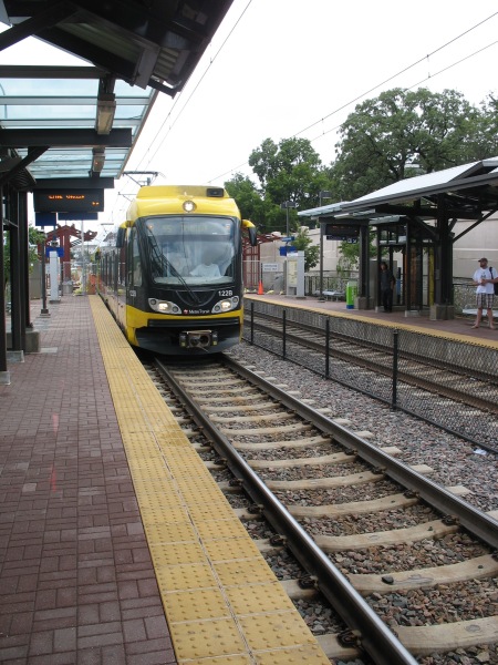
Following up on the post from the Mini-apple on LRT vehicles, I’d like to show some of the more interesting details from the LRT stations that dot the line.  It’s an interesting contrast to DC and Metro.

Metro was designed as a coherent system – from the way the routes interact with one another to the way the signage meshes with the station architecture.  Initial concepts were for all stations to be exactly the same, and though this was soon abandoned in the face of realistic problems, all of the stations in the system nevertheless share several key design principles and materials.  The common elements are so strong that minor deviations from those principles stick out like sore thumbs.

In Minneapolis, such a rigid, systemic design approach wasn’t used.  Each station has not only a rather unique design, they all have their own personality that explicitly aims to reflect the neighborhood they serve rather than the uniformity of the system.  Such is the difference between Federal orthodoxy and Minnesota Nice, I guess. There are a few ‘boilerplate’ stations where the structures are the same, but each station still has distinct color schemes and other small details.

Moreover, each station has a plethora of intricacies for riders to discover.

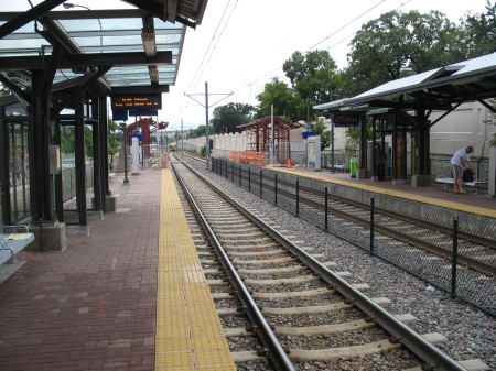
IMG_4435

All stations have several common elements – some sort of partial canopy cover, benches, wind screens, ticket machines, etc.  The details of those elements is where the variations can be found.

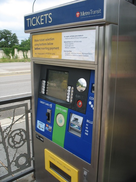
The ticket machines are relatively easy to use – nice and straightforward, accepting of cash and credit.  Your fare is good for 2.5 hours.  It’s a proof of payment system, so you have to grab a ticket before hopping on.

IMG_4434

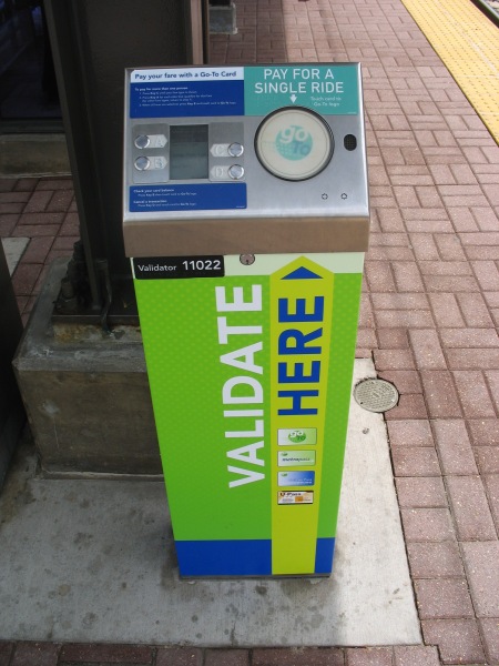
The green circle in the center is an RFID card reader for using a Go To card (Metro Transit’s version of SmarTrip) to purchase a card.  They also have separate machines that cater only to Go To card holders.  Tapping the circle without selecting anything will automatically validate you a base ticket, but there are other options available if you go through the menu (such as buying multiple tickets at once for friends, purchasing longer, round trip fares for sporting events lasting beyond the 2.5 hour time window, etc):

IMG_4433

Once you’ve got your ticket, then you gotta wait for the train.  Currently, headways aren’t bad (but not great, either) – 7.5 minutes during rush hour and 10 minutes at most other times.  Since you’ve likely got some time to kill, you can check out some of the station’s details.

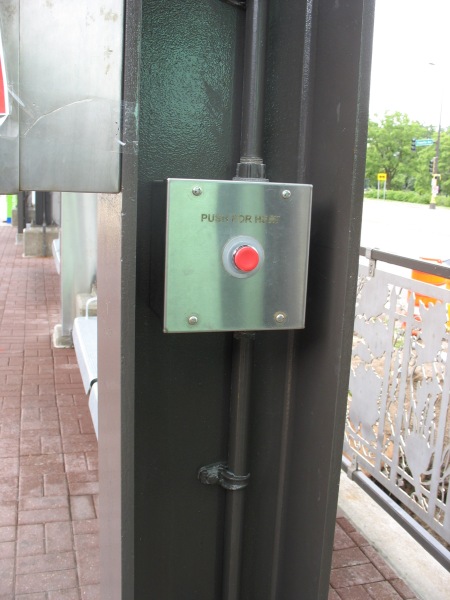
Cold?  Turn up the heat:

IMG_4431

Pushing the red button activates a space heater overhead.  Note the detail on the railing behind the post – there are several different patterns for the various stations.  There’s also work screened onto the glass of the windscreens:

IMG_4430

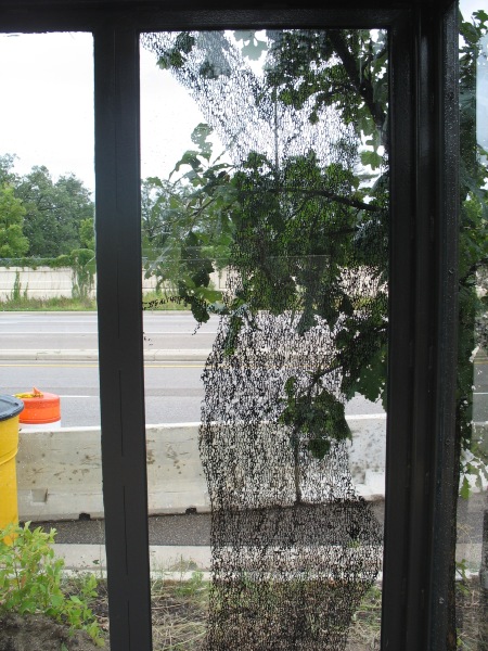
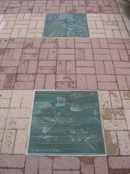
If you can’t tell (and I won’t expect anyone to at this resolution), that’s a long poem shaped in the silhouette of a tree imposed on the glass – that looks out over Hiawatha Avenue at some other nice trees in Minnehaha Park.  Minnehaha Park is the home to Minnehaha Falls, where the Minnehaha Creek cascades down toward the Mississippi River.  There’s some good fishing in the area, and the connection to wildlife at this station is emphasized with reliefs in the pavers:

IMG_4429

You gotta love the Largemouth Bass.

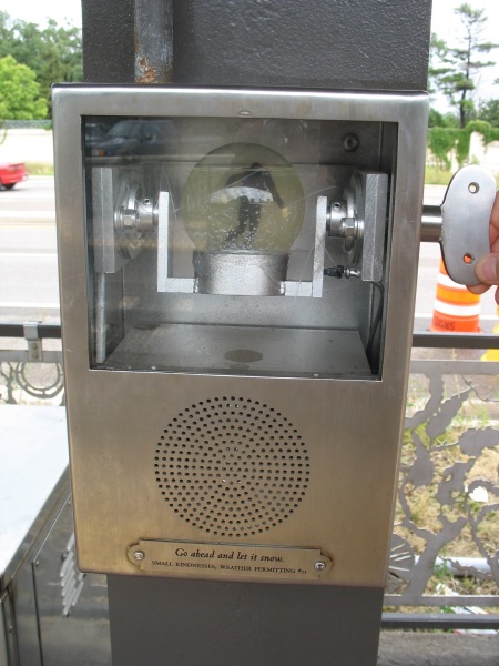
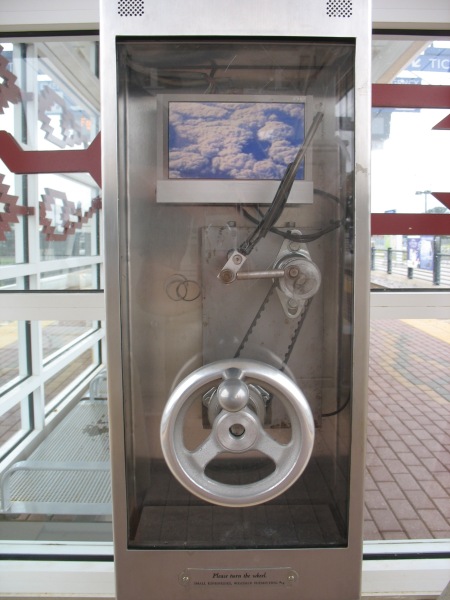
If those passive details aren’t enough to hold your attention, there are other entertainment options.  At stations along the line, there are multiple boxes labeled as “Small Kindnesses, Weather Permitting.” These are a public art installation by artist Janet Zweig:

This public project is an interactive artwork for 11 stations of the Light Rail. There are three or four small kiosks at each of the stations, 35 kiosks in all. There are 11 different kiosk designs: 7 audio designs and 4 video designs, made in editions of 3 or 4 each. Designs include a windshield wiper, a doorbell, a telephone, a curtained theater, a revolving snow-globe, a pinball game, and a “thanks a million” machine. Each unit has a mechanical initiator (like a hand crank, a push button, a lever) and a digital output — either audio only or video with audio. Each unit is weather-proofed, protected behind tamper-proof glass and enclosed in a steel box attached to a station column. The LCD monitors are heated for the cold Minnesota winters.

In the winter of 2003-4, we held a competition for Minnesota filmmakers, videographers, singers, storytellers, comics, etc, to provide content for the kiosks, all on the theme of weather or courtesy (“Minnesota Nice”), the two cliches about Minnesota. The collection of 114 audios and 78 videos were made by over 100 Minnesotans, the result of an open competition and ongoing solicitation of talent through suggestions from arts professionals in Minnesota. The clips last from 30 seconds to 3 minutes. They range from the comedic to the serious, from professional to amateur. On an ongoing basis, this content is delivered to the 39 units, activated when someone on the platform discovers the unit and activates the mechanical initiator. All content goes to every kiosk, providing visitors with always varying artwork while waiting for the trains.

IMG_4432

Go ahead and let it snow.

IMG_4485

The popularity of the line is self-evident both from the patrons and from the construction.  When initially built, several expensive stations (those underground or on aerial structures) were built to accommodate three-car trains, the theoretical max for the system.  All the remaining stations are currently having their platforms extended to meet the demand for three-car trains (a single articulated car is about 95 feet long, thus a three-car consist would be close to 300′ long total, just shy of a 4-car Metro train).

IMG_4428

Every station has a couple of platform information displays, as well.  However, the best these do is display rolling information (such as station closures – there were a couple on this day for platform extension work) and the time of day – as well as the vitally important information telling you that you’re riding the Hiawatha line.  No next train arrival time – perhaps one of the single greatest things about DC’s Metro stations.

You wouldn’t think this feature would be so difficult to implement…

IMG_4436

Minneapolis – LRT Vehicles

My semi-regular voyages back home to Minnesota afford me a great chance to ride Minneapolis’ sole light rail line, the Hiawatha Line.  It stands in such contrast to DC’s Metro – Metro is a system, this (currently) is just one line; Metro’s stations are all similar, while each Hiawatha station has individual designs; Metro is relatively old, Hiawatha is almost brand new.

Either way, it’s worth a ride. It even offers a few lessons for DC’s transit systems.

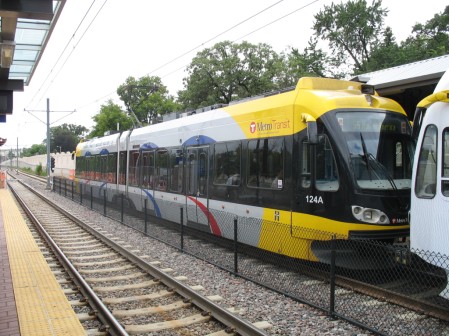
First, a look at the LRVs on the line:

IMG_4425

Many vehicles are fully ‘wrapped’ in rolling ads (such as the 2nd car in the pic above, just off the screen to the right).  Metro’s been doing some of this, but the vehicles are almost never fully encompassed by the wrap, and the fact that they’re in tunnels a great deal of the time means you don’t see giant ads rolling down the street.

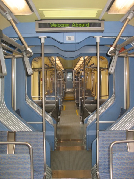
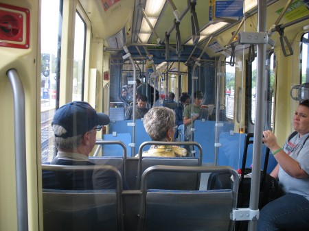
Inside, the cars are relatively spacious, connecting between the articulated portions:

IMG_4479

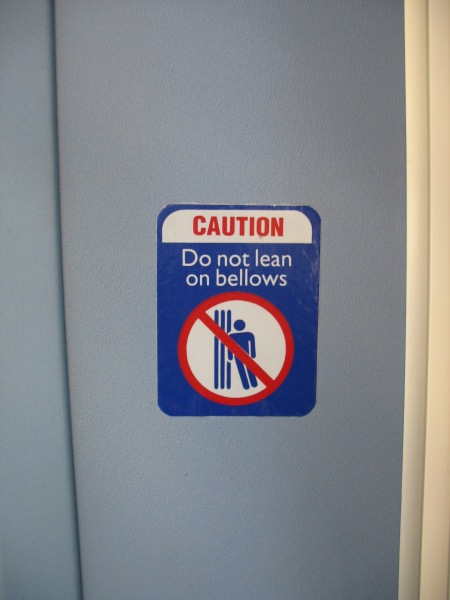
Just make sure you don’t lean on the bellows

IMG_4483

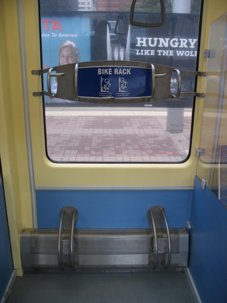
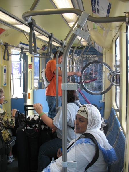
The cars come complete with bike racks, which were well utilized during my weekday rides.

IMG_4478

(also note that the tint on the window in this picture is the interior of a rail car with an ad wrap on it – you can still see out fairly well)

IMG_4439

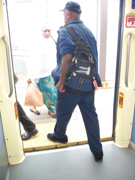
All of the cars have low floors and level boarding with the platforms:

IMG_4438

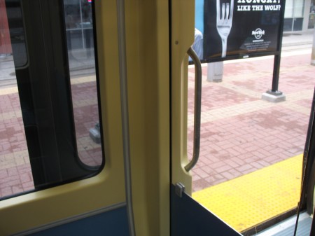
The doors on the cars also push outward towards the platform and then slide to the left or the right, allowing for windows in the vehicle to come right up to the edge of the doors.  Many armchair transit operators wish Metro had more and/or wider doors, but with their current configuration, that would also mean fewer windows on the train – making it harder to see stops, signage, etc.  Might this work in a subway setting? Then again, given the rate at which Metro doors break, adding more complexity to the mechanisms probably isn’t the best idea…

IMG_4481

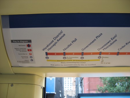
Line signage also offers information on connecting bus routes available at each station, travel time between stations, etc:

IMG_4480

This kind of information can be easily displayed in a static medium (as seen here) on a one-line system, but covering all this information on a much larger system such as Metro is effectively impossible with static signage.  However, the 7000 series railcars will feature LCD displays in each car.  WMATA’s documents indicate those displays would show the “Metro channel,” presumably something similar to the new replacement platform displays they’d like to see.  However, such variable displays would also be able to show information like this, varying depending upon which line the car is serving at that particular time.  DCist at least hinted at the possibility of these LCD displays showing “interactive maps.”

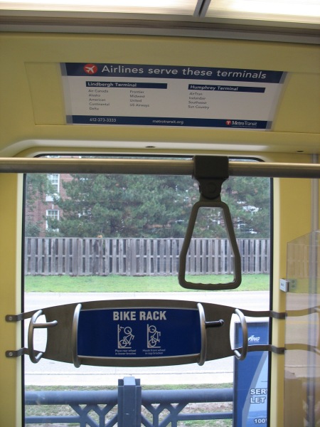
Speaking of signage, the Hiawatha line aims to correct one sore spot of patrons flying out of MSP International – telling you which airlines serve which terminal:

IMG_4487

For those unfamiliar with MSP, each of the airport’s two terminals have LRT stations.  Since the line opened, the smaller Humphrey terminal has seen an increased role in airport operations.  LRVs travel between the two stations 24 hours a day to provide the official circulator between the two, should you need to transfer from one gate to the other (no matter how rare this is).

IMG_4437

Like Metro’s original interior color scheme, I’m not sure this one will stand the test of time – but it’s a functional layout and seems to be well recieved in a region that doesn’t have a strong transit-riding culture (yet).