Following up on the post from the Mini-apple on LRT vehicles, I’d like to show some of the more interesting details from the LRT stations that dot the line. It’s an interesting contrast to DC and Metro.
Metro was designed as a coherent system – from the way the routes interact with one another to the way the signage meshes with the station architecture. Initial concepts were for all stations to be exactly the same, and though this was soon abandoned in the face of realistic problems, all of the stations in the system nevertheless share several key design principles and materials. The common elements are so strong that minor deviations from those principles stick out like sore thumbs.
In Minneapolis, such a rigid, systemic design approach wasn’t used. Each station has not only a rather unique design, they all have their own personality that explicitly aims to reflect the neighborhood they serve rather than the uniformity of the system. Such is the difference between Federal orthodoxy and Minnesota Nice, I guess. There are a few ‘boilerplate’ stations where the structures are the same, but each station still has distinct color schemes and other small details.
Moreover, each station has a plethora of intricacies for riders to discover.
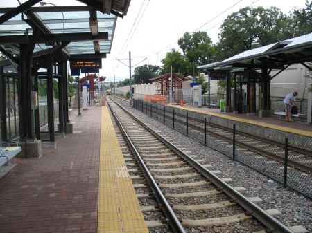
All stations have several common elements – some sort of partial canopy cover, benches, wind screens, ticket machines, etc. The details of those elements is where the variations can be found.
The ticket machines are relatively easy to use – nice and straightforward, accepting of cash and credit. Your fare is good for 2.5 hours. It’s a proof of payment system, so you have to grab a ticket before hopping on.
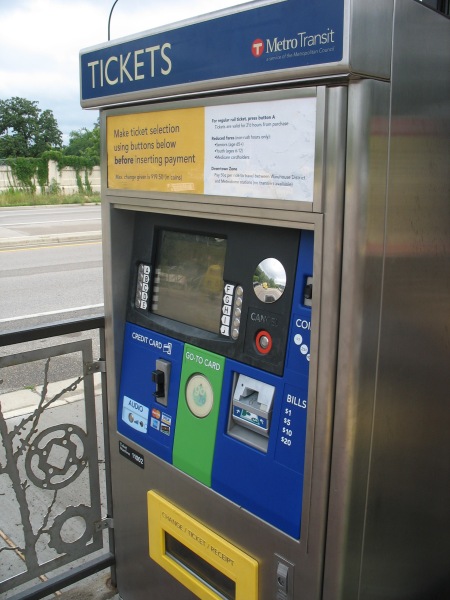
The green circle in the center is an RFID card reader for using a Go To card (Metro Transit’s version of SmarTrip) to purchase a card. They also have separate machines that cater only to Go To card holders. Tapping the circle without selecting anything will automatically validate you a base ticket, but there are other options available if you go through the menu (such as buying multiple tickets at once for friends, purchasing longer, round trip fares for sporting events lasting beyond the 2.5 hour time window, etc):
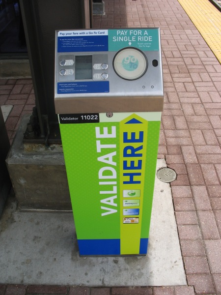
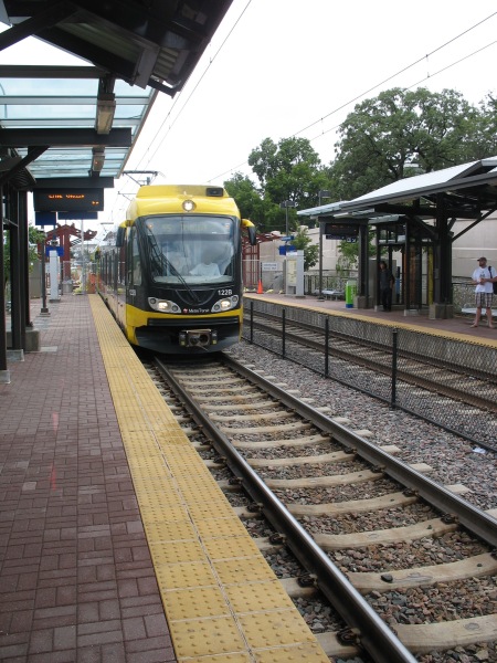
Once you’ve got your ticket, then you gotta wait for the train. Currently, headways aren’t bad (but not great, either) – 7.5 minutes during rush hour and 10 minutes at most other times. Since you’ve likely got some time to kill, you can check out some of the station’s details.
Cold? Turn up the heat:
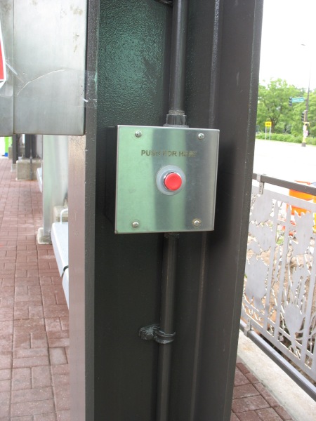
Pushing the red button activates a space heater overhead. Note the detail on the railing behind the post – there are several different patterns for the various stations. There’s also work screened onto the glass of the windscreens:
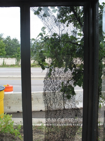
If you can’t tell (and I won’t expect anyone to at this resolution), that’s a long poem shaped in the silhouette of a tree imposed on the glass – that looks out over Hiawatha Avenue at some other nice trees in Minnehaha Park. Minnehaha Park is the home to Minnehaha Falls, where the Minnehaha Creek cascades down toward the Mississippi River. There’s some good fishing in the area, and the connection to wildlife at this station is emphasized with reliefs in the pavers:
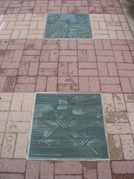
You gotta love the Largemouth Bass.
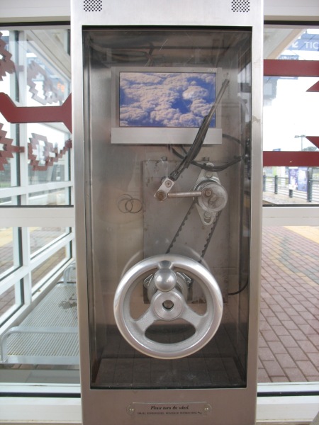
If those passive details aren’t enough to hold your attention, there are other entertainment options. At stations along the line, there are multiple boxes labeled as “Small Kindnesses, Weather Permitting.” These are a public art installation by artist Janet Zweig:
This public project is an interactive artwork for 11 stations of the Light Rail. There are three or four small kiosks at each of the stations, 35 kiosks in all. There are 11 different kiosk designs: 7 audio designs and 4 video designs, made in editions of 3 or 4 each. Designs include a windshield wiper, a doorbell, a telephone, a curtained theater, a revolving snow-globe, a pinball game, and a “thanks a million” machine. Each unit has a mechanical initiator (like a hand crank, a push button, a lever) and a digital output — either audio only or video with audio. Each unit is weather-proofed, protected behind tamper-proof glass and enclosed in a steel box attached to a station column. The LCD monitors are heated for the cold Minnesota winters.
In the winter of 2003-4, we held a competition for Minnesota filmmakers, videographers, singers, storytellers, comics, etc, to provide content for the kiosks, all on the theme of weather or courtesy (“Minnesota Nice”), the two cliches about Minnesota. The collection of 114 audios and 78 videos were made by over 100 Minnesotans, the result of an open competition and ongoing solicitation of talent through suggestions from arts professionals in Minnesota. The clips last from 30 seconds to 3 minutes. They range from the comedic to the serious, from professional to amateur. On an ongoing basis, this content is delivered to the 39 units, activated when someone on the platform discovers the unit and activates the mechanical initiator. All content goes to every kiosk, providing visitors with always varying artwork while waiting for the trains.
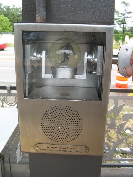
Go ahead and let it snow.
The popularity of the line is self-evident both from the patrons and from the construction. When initially built, several expensive stations (those underground or on aerial structures) were built to accommodate three-car trains, the theoretical max for the system. All the remaining stations are currently having their platforms extended to meet the demand for three-car trains (a single articulated car is about 95 feet long, thus a three-car consist would be close to 300′ long total, just shy of a 4-car Metro train).

Every station has a couple of platform information displays, as well. However, the best these do is display rolling information (such as station closures – there were a couple on this day for platform extension work) and the time of day – as well as the vitally important information telling you that you’re riding the Hiawatha line. No next train arrival time – perhaps one of the single greatest things about DC’s Metro stations.
You wouldn’t think this feature would be so difficult to implement…

Interesting that you’d mention that about minor deviations in Metro-brutal: while I agree with what you said earlier about canopies, I have to say that it makes even the small differences between stations apparent. I’ve spent much longer than any person should squinting at the boxier shape and lower relief of the coffer design at Smithsonian station, which wouldn’t really be noticeable at all if it weren’t for the uniformity of the system overall.
Then again, does anybody else notice things like that?
J.D., you’re not the only one who notices all the little differences. Like the fact that L’Enfant Plaza’s lower level walls are vertical, the various different mezzanine locations and escalator/elevator combinations, etc.
In Arizona the Light Rail that was made down here you don’t need pay before you get on but when you get off have to prove show prof of payment i think the Light Rail Arizona needs a lot of work and way it is set on its routs i don’t think most people need i also think wast of money however it is the first one in Arizona so we must give it sometime and see
Pingback: Midwest Miscellany | Michigan Real Estate