My semi-regular voyages back home to Minnesota afford me a great chance to ride Minneapolis’ sole light rail line, the Hiawatha Line. It stands in such contrast to DC’s Metro – Metro is a system, this (currently) is just one line; Metro’s stations are all similar, while each Hiawatha station has individual designs; Metro is relatively old, Hiawatha is almost brand new.
Either way, it’s worth a ride. It even offers a few lessons for DC’s transit systems.
First, a look at the LRVs on the line:
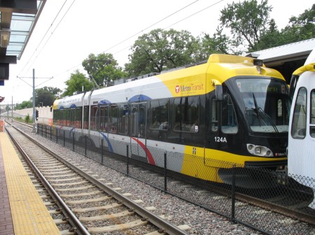
Many vehicles are fully ‘wrapped’ in rolling ads (such as the 2nd car in the pic above, just off the screen to the right). Metro’s been doing some of this, but the vehicles are almost never fully encompassed by the wrap, and the fact that they’re in tunnels a great deal of the time means you don’t see giant ads rolling down the street.
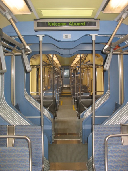
Inside, the cars are relatively spacious, connecting between the articulated portions:
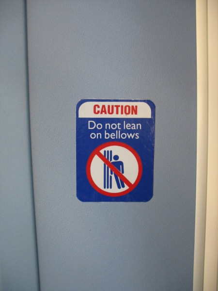
Just make sure you don’t lean on the bellows…
The cars come complete with bike racks, which were well utilized during my weekday rides.
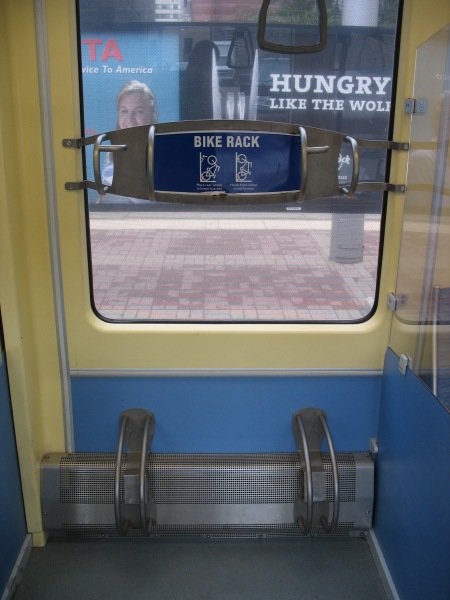
(also note that the tint on the window in this picture is the interior of a rail car with an ad wrap on it – you can still see out fairly well)
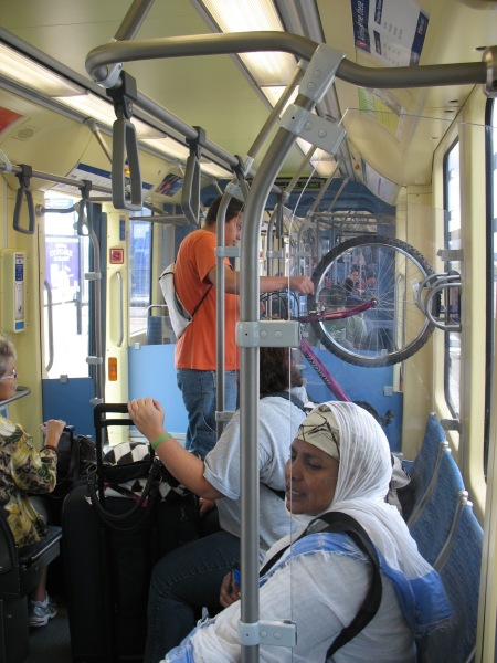
All of the cars have low floors and level boarding with the platforms:
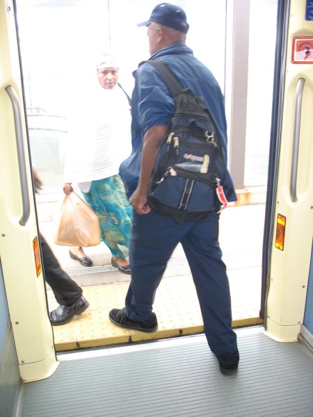
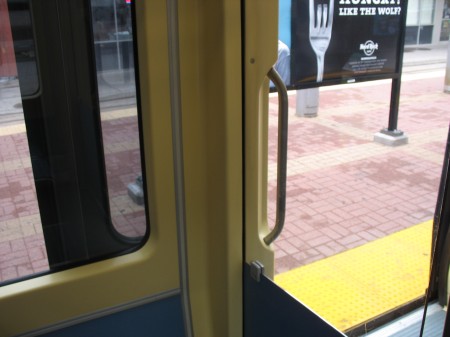
The doors on the cars also push outward towards the platform and then slide to the left or the right, allowing for windows in the vehicle to come right up to the edge of the doors. Many armchair transit operators wish Metro had more and/or wider doors, but with their current configuration, that would also mean fewer windows on the train – making it harder to see stops, signage, etc. Might this work in a subway setting? Then again, given the rate at which Metro doors break, adding more complexity to the mechanisms probably isn’t the best idea…
Line signage also offers information on connecting bus routes available at each station, travel time between stations, etc:
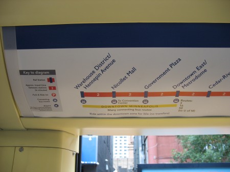
This kind of information can be easily displayed in a static medium (as seen here) on a one-line system, but covering all this information on a much larger system such as Metro is effectively impossible with static signage. However, the 7000 series railcars will feature LCD displays in each car. WMATA’s documents indicate those displays would show the “Metro channel,” presumably something similar to the new replacement platform displays they’d like to see. However, such variable displays would also be able to show information like this, varying depending upon which line the car is serving at that particular time. DCist at least hinted at the possibility of these LCD displays showing “interactive maps.”
Speaking of signage, the Hiawatha line aims to correct one sore spot of patrons flying out of MSP International – telling you which airlines serve which terminal:
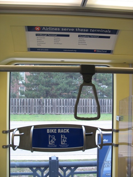
For those unfamiliar with MSP, each of the airport’s two terminals have LRT stations. Since the line opened, the smaller Humphrey terminal has seen an increased role in airport operations. LRVs travel between the two stations 24 hours a day to provide the official circulator between the two, should you need to transfer from one gate to the other (no matter how rare this is).
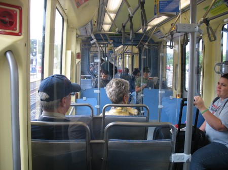
Like Metro’s original interior color scheme, I’m not sure this one will stand the test of time – but it’s a functional layout and seems to be well recieved in a region that doesn’t have a strong transit-riding culture (yet).

Pingback: Minneapolis – LRT Stations « city block